Curio

Brand identity · Illustration · Digital

Curio is a learning platform designed for curiosity-driven learners, broad interests, and nonlinear paths through knowledge. Instead of organizing learning around a fixed curriculum, Curio creates a more fluid experience where people can follow their interests, discover unexpected connections, and build knowledge over time.

​

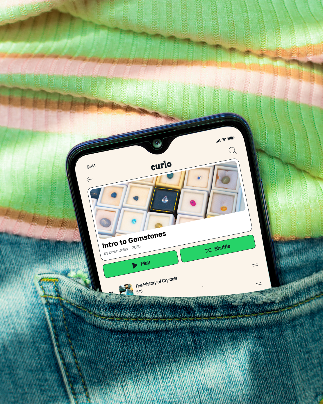
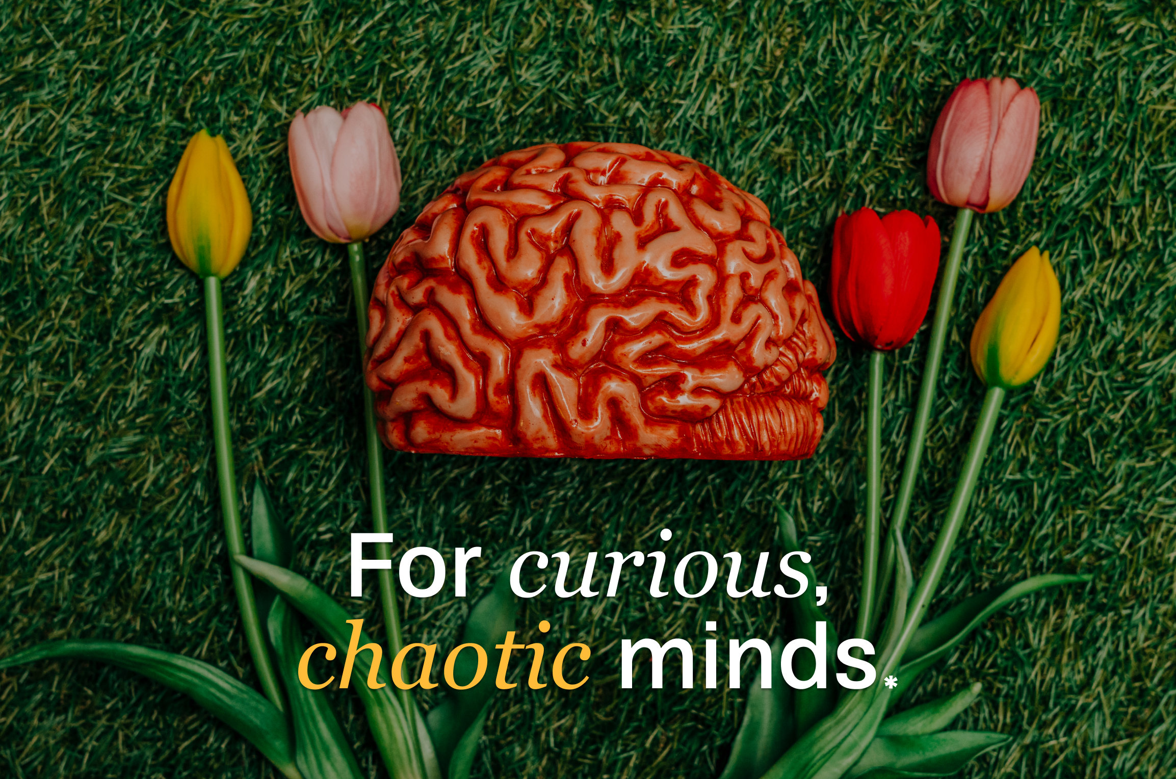
The visual identity reflects that sense of exploration. Handcrafted textures, expressive illustration, playful typography, and a fluid visual system give Curio a personality that feels approachable and curious rather than institutional. The same language carries through the product experience, creating a cohesive world across the brand, interface, and marketing materials.

I developed the brand identity, visual system, interface design, illustrations, motion, and supporting marketing materials in collaboration with Brooke Winston, who contributed to strategy and concept development. Together, we shaped the experience from its initial idea through its visual and digital expression.

​

Curio takes a deliberately different approach to educational design, using color, texture, illustration, and interaction to give learning a more expressive personality. The result is a visual world designed to make exploration feel less rigid and more like something you can wander into.
Heuristics evaluation graph
Shiftkey hero image
Heuristics evaluation graph

If you have any inquiries or just want to say hi, feel free to reach out! 

chris@kutzpa.com

/in/christopher-whittemore

@shapesandstufff

Back to top

Curio

Brand identity · Illustration · Digital

Curio is a learning platform designed for curiosity-driven learners, broad interests, and nonlinear paths through knowledge. Instead of organizing learning around a fixed curriculum, Curio creates a more fluid experience where people can follow their interests, discover unexpected connections, and build knowledge over time.

​

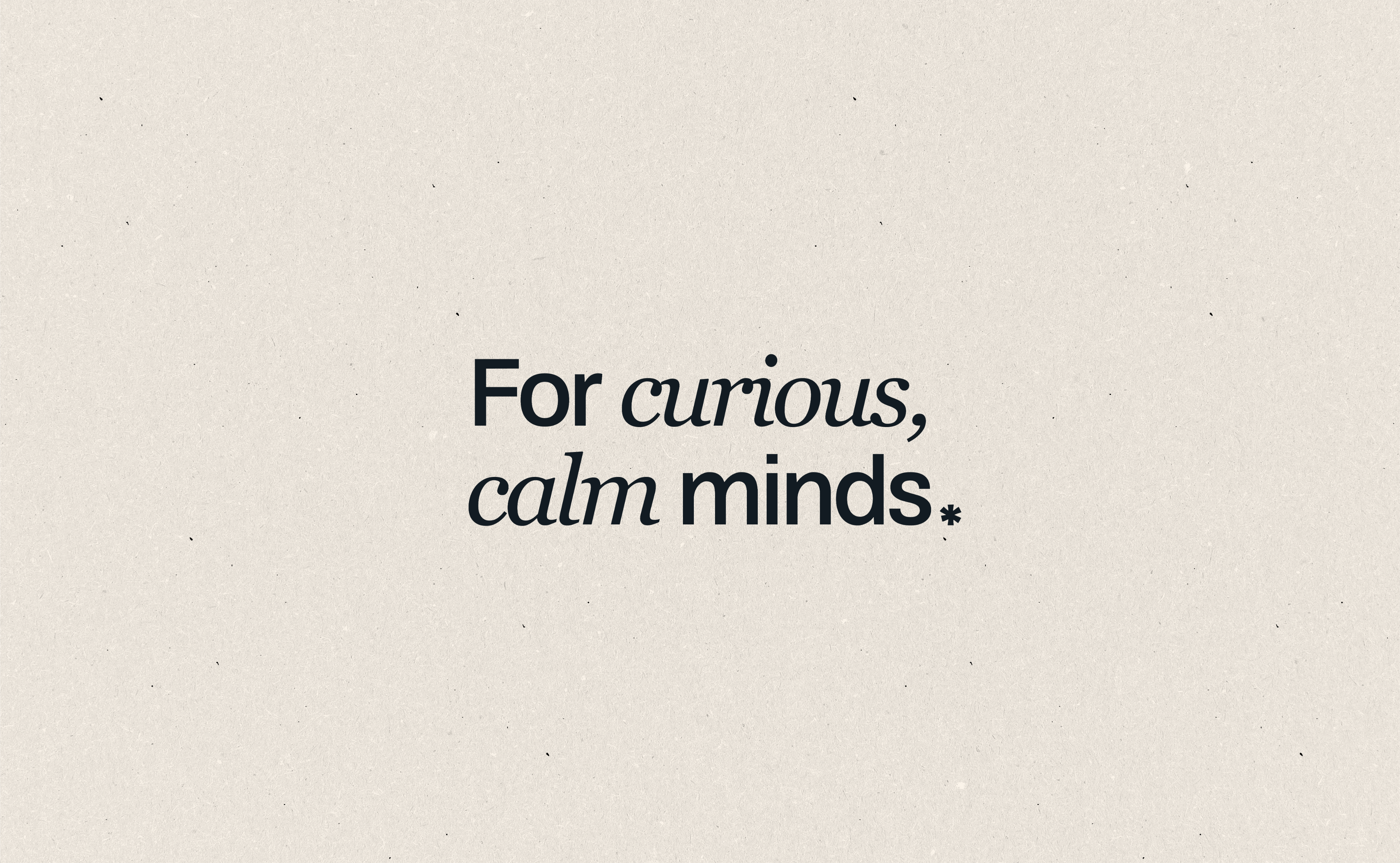
The visual identity reflects that sense of exploration. Handcrafted textures, expressive illustration, playful typography, and a fluid visual system give Curio a personality that feels approachable and curious rather than institutional. The same language carries through the product experience, creating a cohesive world across the brand, interface, and marketing materials.

I developed the brand identity, visual system, interface design, illustrations, motion, and supporting marketing materials in collaboration with Brooke Winston, who contributed to strategy and concept development. Together, we shaped the experience from its initial idea through its visual and digital expression.

​

Curio takes a deliberately different approach to educational design, using color, texture, illustration, and interaction to give learning a more expressive personality. The result is a visual world designed to make exploration feel less rigid and more like something you can wander into.
Heuristics evaluation graph
Shiftkey hero image
Heuristics evaluation graph

If you have any inquiries or just want to say hi, feel free to reach out! 

chris@kutzpa.com

in/christopher-whittemore/

@shapesandstufff

Back to top

Curio

Brand identity · Illustration · Digital

Curio is a learning platform designed for curiosity-driven learners, broad interests, and nonlinear paths through knowledge. Instead of organizing learning around a fixed curriculum, Curio creates a more fluid experience where people can follow their interests, discover unexpected connections, and build knowledge over time.

​

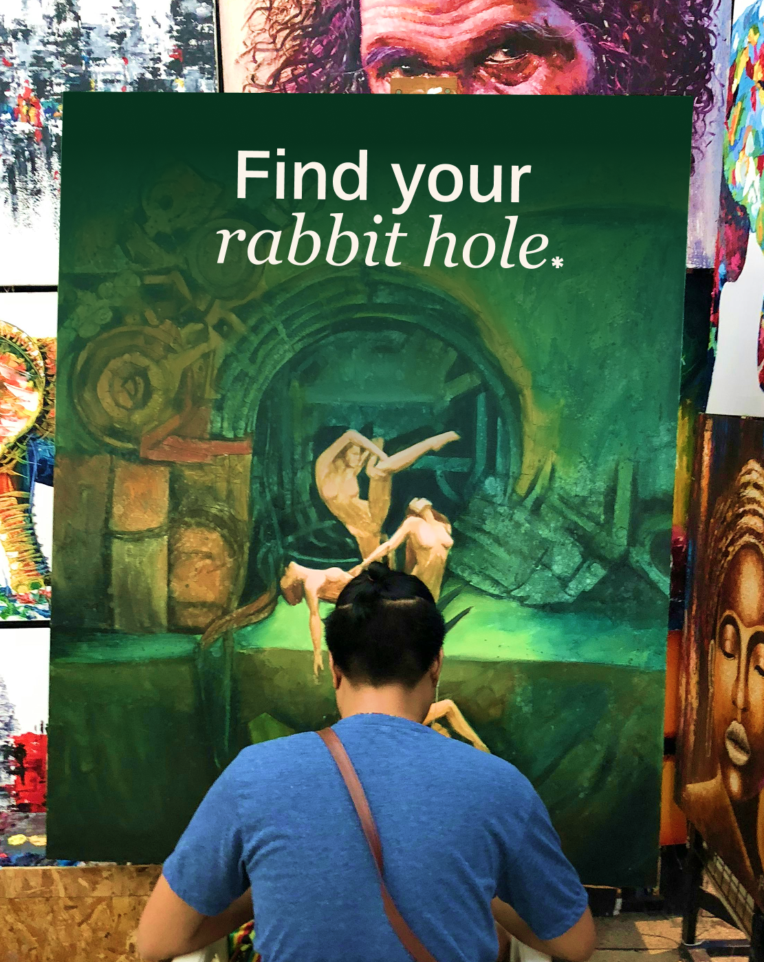
The visual identity reflects that sense of exploration. Handcrafted textures, expressive illustration, playful typography, and a fluid visual system give Curio a personality that feels approachable and curious rather than institutional. The same language carries through the product experience, creating a cohesive world across the brand, interface, and marketing materials.

I developed the brand identity, visual system, interface design, illustrations, motion, and supporting marketing materials in collaboration with Brooke Winston, who contributed to strategy and concept development. Together, we shaped the experience from its initial idea through its visual and digital expression.

​

Curio takes a deliberately different approach to educational design, using color, texture, illustration, and interaction to give learning a more expressive personality. The result is a visual world designed to make exploration feel less rigid and more like something you can wander into.
Heuristics evaluation graph
Shiftkey hero image
Heuristics evaluation graph

If you have any inquiries or just want to say hi, feel free to reach out! 

chris@kutzpa.com

/in/christopher-whittemore

@shapesandstufff

Back to top